


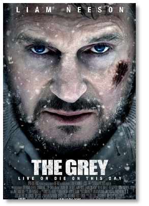
The above is a real poster which uses a simple portrait taken at a somewhat unusual angle and then overlaid with a red/orange filter.It is a simple, even generic, way to construct posters for films which are essentially about a single character.
The text offers us the title, the star and the name of the director and the generic tiny list of necessary credits at the poster’s base. It is a simple formula and one that would suit a range of genres; above all it is a formula that Benton students could easily use.You have access to a range of faces young and old and Serif PagePlus and Photoshop are both available on school computers.See range of examples below.


These posters are essentially simple and often apply texture to the image to make it seem more gritty (film grain for the “Kes” poster,computer code for the Gary Oldman film) The poster for “Submarine” ,above, is clever but very simple: blue over a simple black and white portrait to suggest the lad is “going under” and text which reinforces that idea. I append below some posters I have made myself using this simple formula. Remember the “Teaser” poster is often very simple and often sparing in its use of text


What should be on your poster?
It depends whether your poster is a “teaser” poster designed for display months before the film releases or whether it will be displayed when the film opens.
The “teaser” poster is often quite lean on text and basic information,it might not even name the star/s and it certainly won’t carry review quotes.It is often quite enigmatic as its “teaser” name implies.
If it is a poster for opening week it will carry some but not necessarily all of the following,
the film’s title.
a tagline,
a certification logo,
the names of the principal stars,
quotes from reviews,
stars from review gradings,
reminders of track records of director and stars and
a lengthy list of credits at the poster’s base and
The Dolby sound logo.
Some films,often “arthouse” films, take the selling approach that “less is more” and are often quite stark avoiding textual clutter.
I append some useful graphic “bits and bobs” below as well as some websites which go into poster design in more detail.
Credit bloc templates can be downloaded from here
http://www.tipsquirrel.com/movie-


Larger versions of these certication logos can be found here:
http://en.wikipedia.org/wiki/British_Board_of_Film_Classification#mediaviewer/File:BBFC_12A.svg

Below are examples of what are called credit blocks and must appear on main film posters by law though they don’t always appear on “teaser” posters. I also append a site where Photoshop text templates of this block can be down loaded.


Below is a brilliant step by step guide to making a movie poster.

This site also has an excellent set of thoroughly explained tips for title design, the dos and don’ts
http://www.zevendesign.com/1462/blog/5-
Below some examples of Dolby sound logos which will add a sense of authenticity to your posters


EVALUATION Level 4: 8 -
Excellent ability to evaluate what the production reveals about film study areas.
Written communication excellent.
The use of key film concepts and appropriate specialist terminology will be confident and well -
Theses are the descriptors for the top marks for the poster design and evaluation
POSTER Level 4: 2 4 -
Excellent ability to use creative and technical skills to construct film products.
Where relevant: written communication excellent.
Confident and well integrated use of appropriate specialist terminology
Some of the chief examiner’s remarks on the practical projects:
Final production: poster campaign
The popularity of posters continues, but the gap between the best and least successful examples seems to be large.
At level 4(see above), work is often indistinguishable from industry output and the attention to detail is excellent. If done well, candidates can show artistic ability and confidently convey ideas about genre, narrative and industry. The worst examples lack creativity and often highlight that limited study of posters has been undertaken. It is also worth noting that candidates who do not have access to digital imaging software struggle to convey their ideas effectively and may be better advised to consider one of the other options.
Evaluative analysis
For the evaluative analysis many candidates still evaluate the whole process, approaching the task as a piece of self -
Only the final production i.e. your poster, should be analysed and the discussion should centre around how successfully the finished production communicated with the audience.
The task most closely related to this is the micro analysis, and the best centres took a similar approach with candidates identifying significant features from their production and discussing how an audience might respond to these features. Adjusting this to fit the requirements of the task is not that difficult, if candidates feel compelled to write what they did, they should follow up each point they make with a reference to how an audience might respond to this.
The pitch, pre-
TIP:
It might be useful to work as follows: think about what poster you could make successfully, given that you have to make your own original photographs or images, and then work backwards, as it were, to a pitch which would explain or justify why your poster is as it is.

Ordinary local photos become posters
Below some demolition work in Leeds shot from the car becomes more evocative if tinted green and sandwiched with some grungy texture


Add a title in the right font style (trajan pro) and perhaps darken a little more and we are heading towards suggesting/evoking an end of the world scenario. Can you suggest a tagline?
A bridesmaid photographed outside Leeds Town Hall can easily be transformed into a rather disturbing image by darkening,by cropping and turning up the grain and contrast.


We add a title (trajan Pro again) and we have evoked something…what sort of story might we have evoked?


A simple formal portrait can easily be textured and coloured to suggest or evoke a nineteenth century person


Choose the right local “location” take a simple photograph, as if you were in hiding or spying, darken and add some texture, a title,a tagline and all the other bits and bobs and you have an effective horror genre poster